Last year I purchased a sports watch to keep track of my bike commute. Recently I got the impression that I’m slowing down. I downloaded the data and analyzed it a bit.
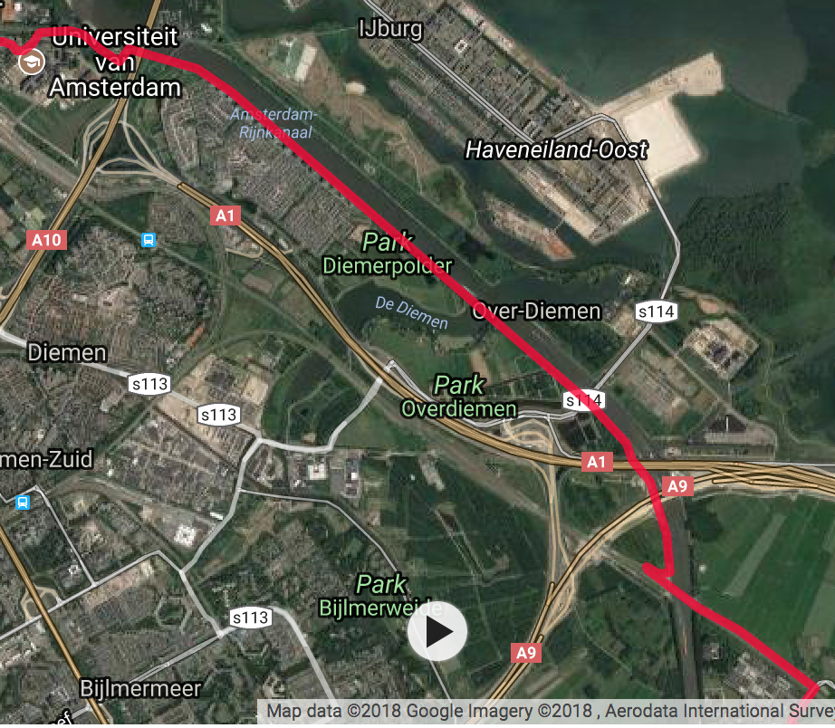
Figure 1: my route to work (most of it). I live in the lower right corner.
My commute is about 9.4 km. I selected data that is between 9.2 and 9.6 km. This accounts for small variations, but it excludes when I go into the city and do some shopping. The problem is not so much the different distance, but the speed. I want to keep it safe and won’t rush. Most of my commute is however on a long bicycling path next to a canal, as shown in the image above. I live in the lower right corner and I work in the upper left corner.
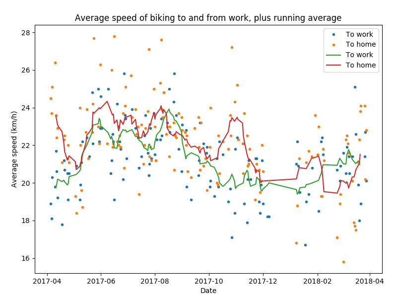
Figure 2: average speed over time, separated for going to work and going home. The gap in december 2017/januari 2018 is because of the Christmas holidays. The gap in February is due to syncing issues.
The figure above shows the average speed for every day. The two colors show my commute to work (blue) and home (orange). The green and red line are a running average over 5 data points. My average speed has indeed dropped a bit. It used to be about 22.5 km/h, now it is about 21.0 km/h. This is still a very nice average speed for a completely human-powered bike.
At least as interesting is the difference between going to work and going home again, with average speeds of 21.3 km/h and 22.2 km/h respectively. The histogram below shows the difference clearly.
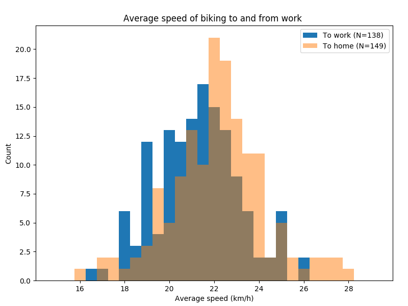
Figure 3: Histogram of the average speed going to work (blue) and going home (orange).
I suspect that the rail bridge plays a role. On my way to work, the downhill section has a sharp U-turn and another inconvenient corner, really slowing me down. On my way home the road after the bridge is more or less straight, so I can continue biking at high speed.
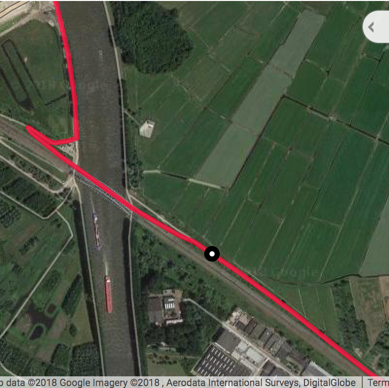
Figure 4: the bridge over the canal.
An obvious suspect is the wind. For individual bike rides this is obviously a factor. For example on March 2nd I had a 31 km/h south-east head wind when I went home, resulting in an average speed of 15.8 km/h. In November the wind was more north-westerly, resulting in a higher average speed going home. The predominant wind direction in the Netherlands is however from the south-west and my route is perpendicular to that.
What can be the reason for the recent slowdown? Part of it is that I am wearing different, longer, gloves that make it impossible to look at my watch. The watch shows different heart rate ranges and I tried to keep an eye on it to maintain a constant heart rate. Because of the gloves I can’t do this anymore.
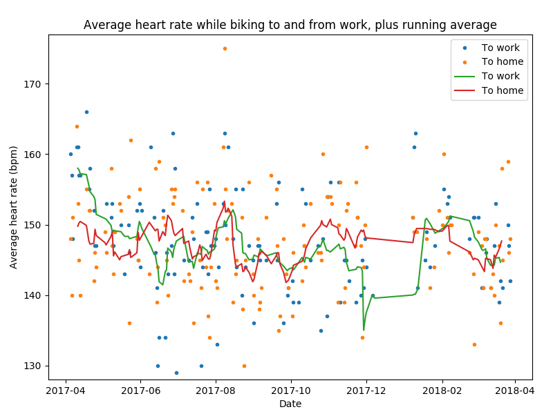
Figure 5: average heart rate over time, separated for going to work and going home.
In the figure above I plot my average heart rate, and a running average. Aside from the first month or so it is stable between 140 and 150 bpm. Below, I made a plot of the correlation between average speed and average heart rate. For the bulk of the data there is no obvious correlation.
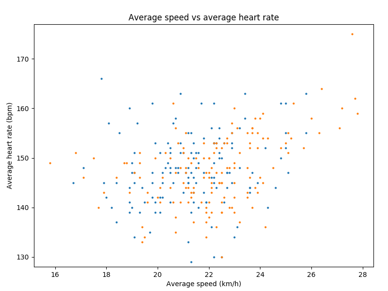
Figure 6: (lack of) correlation between average heart rate and average speed.
Is there an obvious conclusion to this story? Not really, but it was fun to look at the data in more detail.