Directly after I installed Mac OS X Yosemite on my computer last week I had the impression that the “x” in the close-window button was off-center (Figure 1).
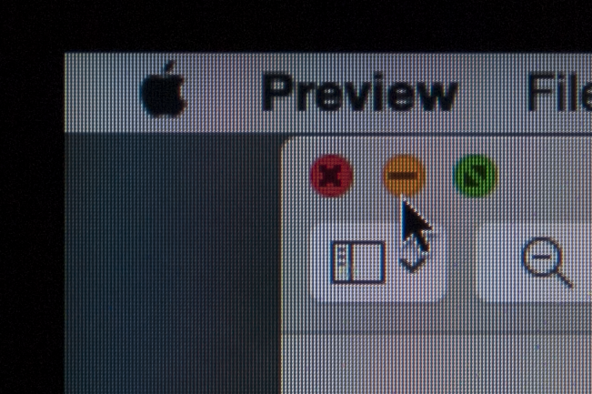
Figure 1. The “x” in the close button appears off-center.
I was not the only one. John Siracusa (of Mac OS X review fame) tweeted:
A reminder for glasses wearers: this is why the “x” looks like it’s not centered in the close widget in Yosemite chromatic aberration.
The index of refraction of materials is wavelength dependent. This is visible when lenses are used because the focal point differs slightly for different wavelengths (1). In photos this results in colors that don’t overlap perfectly. Photos taken with cheap cameras/lenses sometimes show a colored band next to a sharp edge (a building or a head). It looks as if a printer (of the professional sort) had difficulty aligning the different colors correctly (you see this sometimes in newspaper photographs). More expensive lenses have a coating to compensate for this chromatic aberration.
It seems that glasses do suffer from chromatic aberration as well, when you look away from the center. Simple test: look at the close button straight, then turn your head sideways and see how the “x” appears to move, googly eye style. However, when there is a straight line between the close button, the center of your glasses and your eyes, the chromatic aberration distorts the image in all directions equally. This would make the “x” look fuzzier, not shifted. Note also that when you rotate your head (or the screen) 90 degrees, the shift is not visible. There must be something else going on.
I decided to take a photo camera and make a picture of the screen (details (2)). After some experimenting I had a picture with 4 camera pixels for every screen pixel, shown in Figure 2. I added a raster of the screen pixels, a yellow square around the “x” and a blue circle around the button. It is clear that the “x” is shifted in the button by half a pixel. On the left there are 2.5 pixels, on the right 3.5 (3). You can argue about the position of the blue circle. You can move it a bit to the left, giving 2.7 pixels on the left and 3.3 on the right. I don’t think you can argue that it can be 3 pixels on both sides.
![]()
Figure 2. Zoomed in. One screen pixel is four camera pixels. The black raster shows the screen pixels, the yellow square shows the outline of the “x” and the blue circle the outline of the button. The circle is half a pixel to the right.
What I think we see is an artifact of the display. A pixel is really three sub-pixels (red, green and blue) positioned next to each other (Figure 3). The positioning of pixels next to each other, horizontally, would explain why we only see this distortion horizontally and not vertically. The three subpixels may also explain why we see 2 2/3 pixels to the left and 3 1/3 pixel to the right (2 and 1 subpixels respectively). On the other hand, I think there is a lot of trickery going on to make screens look good (sub-pixel aliasing and what not), so I am careful with that last statement.
![]()
Figure 3. Four types of computer displays. The MacBook probably has the LCD configuration. More information: https://en.wikipedia.org/wiki/Pixel. Source: https://upload.wikimedia.org/wikipedia/commons/4/4d/Pixel_geometry_01_Pengo.jpg.
In conclusion, the off-center “x” is real and probably an artifact of the display or how it is rendered. It is unlikely that it is the result of chromatic aberration.
Update (2014/10/20, 17:34): Figure 4 shows the situation when the circle and square are centered at the same point. The overlap between the circle and button is clearly incorrect.
![]()
Figure 4. Zoomed in. I moved the circle to the left. The circle and square are now centered at the same point. It is clear that the circle does not overlap properly with the button.
(1) In the lab I once had a lens with a 150 mm focal length for IR (6000 nm) and a 140 mm focal length for red light (632 nm). This is an extreme case of course. ↩
(2) The camera (Pentax K20D, with Pentax SMC DA* 16-50 mm lens) was placed on a tripod. The screen was perpendicular to the optical axis, the close button was centered. The picture was imported into Lightroom 5, cropped and exported as TIFF, without any compression. I added the raster, square and circle in Affinity Designer. The raster was aligned on the ‘x’. I took a screenshot and cropped that in Affinity Designer. I have a mid-2010 15′ MacBook Pro with high-density screen (1680×1050 pixels). ↩
(3) It depends on your frame of reference. I aligned the raster with the “x”, making the button (circle) look off-center. But it can be the other way around. In any case, the two are shifted relative to each other. ↩